United Airlines User Research
Website: United Airlines
Type
Individual Project
Method
User Research
Usability Testing
Tool
Heuristic Evaluation
Cognitive Walkthrough
Duration
Feb 2022 - March 2022
Introduction
United Airlines is an American international airline that operates domestic and international routes across six continents. United Airlines website not only allows users to search, book, and check-in their flights, even find hotels and cars.
The users who are more likely to use the website will be business travelers, travel seekers, or global passengers who want to get high customer service during the whole journey. While United Airlines focuses on users experience, the users will value the service, its convenience, and its efficiency.
Heuristic Evaluation
Heuristic evaluation is a usability method developed by Jakob Nielsen. The below ten general principles are applied to observe usability guidelines for interaction design, and present the United Airlines website findings from the heuristic evaluation.
#1: Visibility of system status
1. The website allows to see the booking system and information at the first sight.
2. It shows “Loading results” to notify users that the website is loading for the search results.
#2: Match between system and the real world
1. The icons and words match each other, and the cart represents your incomplete booking status.
2. The order from book to my trips to check in to fight status make a logical sense.
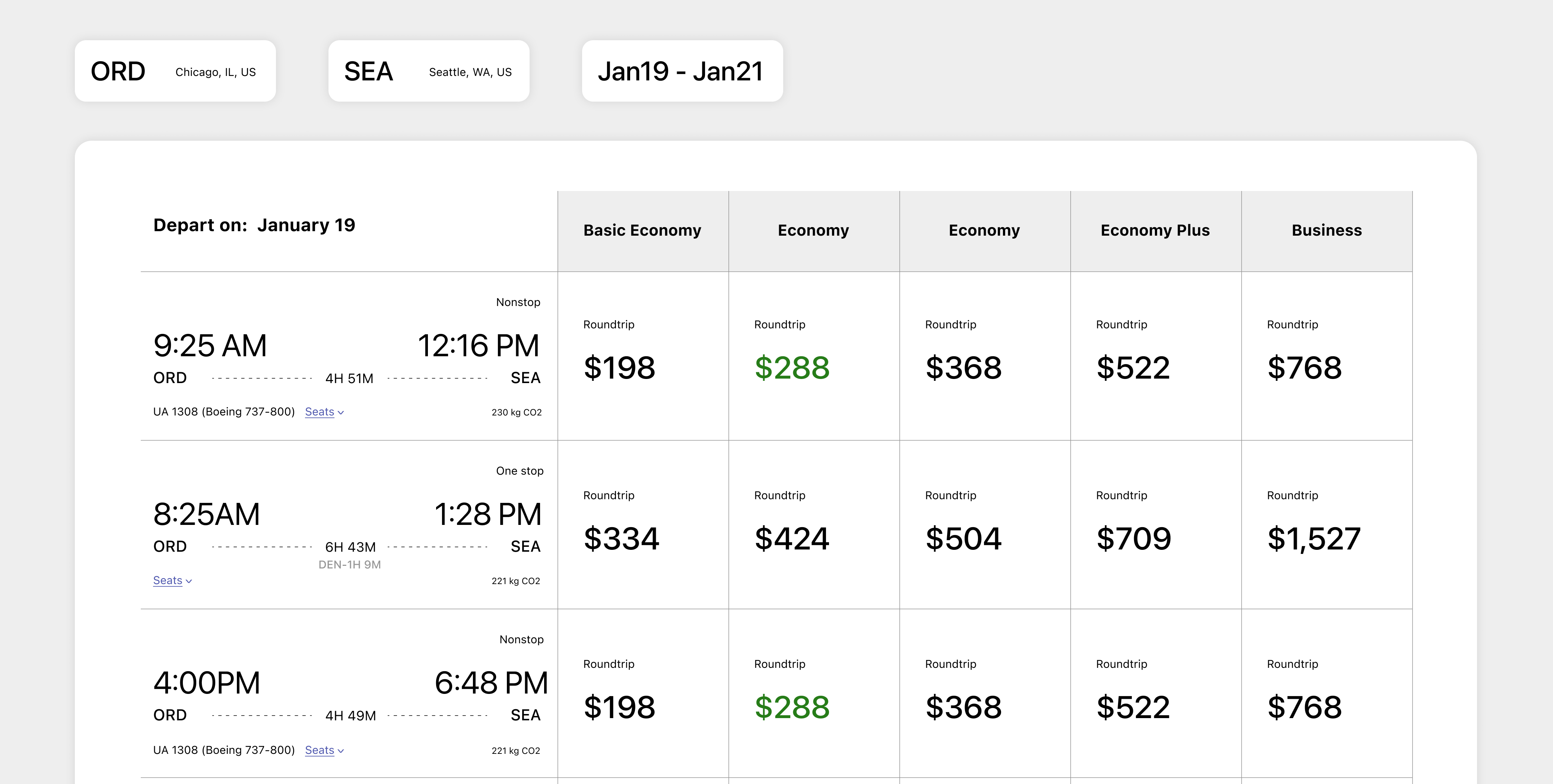
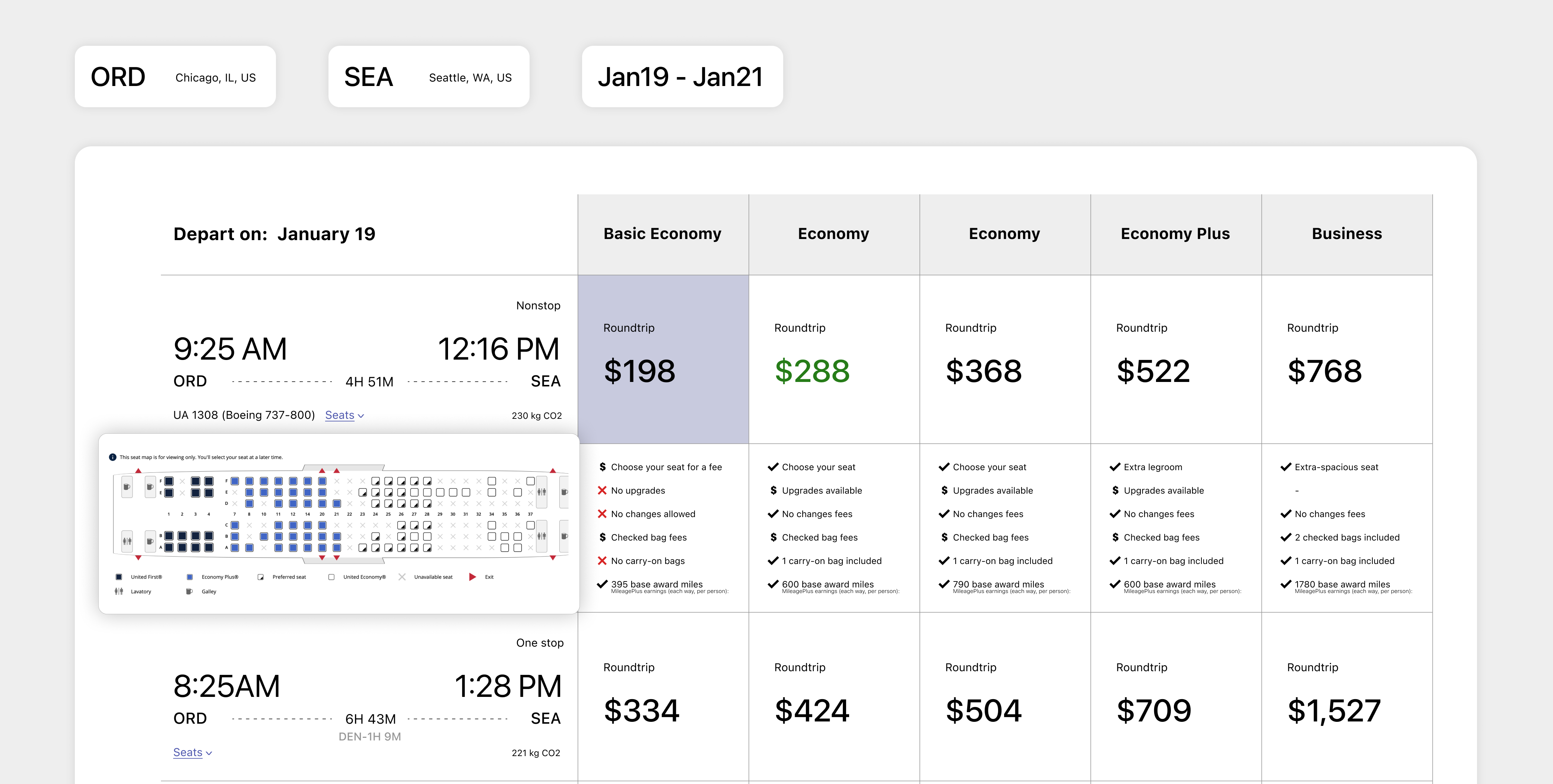
3. The flight information includes the departure -- duration -- arrival, and it helps users relate this arrangement with an actual flight map.
#3: User control and freedom
1. When the website navigates to the next page after users search for the trips, it still keeps the origin searching detail on top of that page.
2. Use the update button to redo your search rather than going back to the homepage.
3. No actual cancel button during the booking process but it allows to remove trips through the cart. (Heuristic Violated)
4. It shows a pop-up screen for clicking sort and filter. The reset button in sort and filter helps users to go back to default search results.
#4: Consistency and standards
1. It follows the expectation that the central part of the homepage is to search for the flights' information.
2. It has consistent checkboxes and radio buttons.
#5: Error prevention
1. They offered suggestions when users typed one or two words in the departure and arrival city's names.
2. Providing helpful constraints to pick a date range logically on the calendar.
#6: Recognition rather than recall
1. The cart offers to save your unfinished booking process and is a function for reducing the use of recall.
#7: Flexibility and efficiency of use
1. Using underline and icons to interpret there are more details will show if you click.
#8: Aesthetic and minimalist design
1. The color is consistent, mainly in blue and purple.
2. The homepage layout is straightforward and simple information.
3. The whole pages are expected in an up to down order.
4. There are some whitespaces on the homepage to give users an idea that different elements and contents are coming up.
5. Just give the exact data on one page and allows users to enter another information step by step by going through other pages.
#9: Help users recognize, diagnose, and recover from errors
1. It shows the error in red context, and warning icon for users to recognize and recheck the missing details.
#10: Help and documentation
1. The search bar is on the top-right corner of the website, as most other websites did.
2. There is a piece of information updated on the top of the website to inform the users.
3. The FAQ section helps users look for some common questions and answers and provides helpful information links.
Cognitive Walkthrough
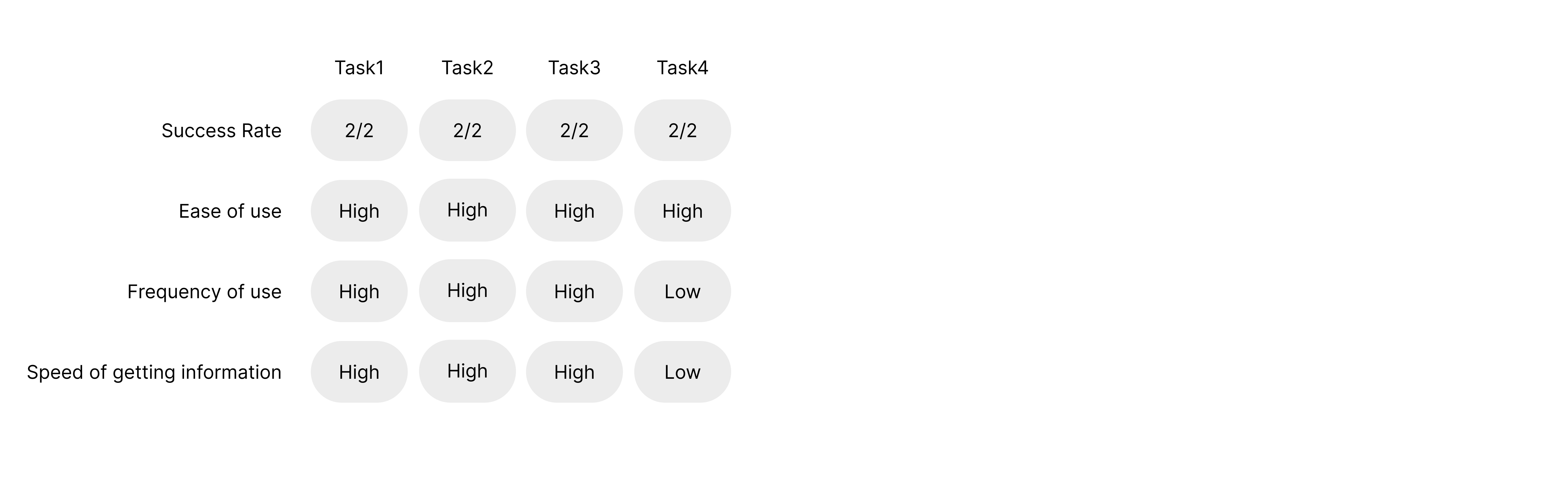
A cognitive walkthrough is a usability method to evaluate the interface. It will set some exploratory questions from the users' perspective to analyze the goal in each step that is satisfied and completed by users. The cognitive walkthrough below demonstrates how the actions on the United Airlines website are assessed during the process. Besides, it presents the results by identifying if the users can carry out the tasks within these usability examinations.
.Task1: Find the soonest flight to Seattle
-
1) Open the site and find the book area
-
2) Select departure, arrival, and date
-
3) Click “Find flights”
-
4) View the meets flight list
-
5) Select the flight to cart
.Task2: Book the previously searched flights
-
1) Click the cart on the right-top corner of the homepage
-
2) Select the previously searched fight
-
3) Enter traveler info
-
4) Click continue to seats
-
5) Select seats on the seat map
-
6) Click continue to payment
-
7) Enter payment info
.Task3: Sign up for an account
-
1) Click "Sign In" on the right-top corner of the homepage
-
2) Click "Join now"
-
3) Enter “About me” information
-
4) Enter “Contact info” information
-
5) Create password
.Recommendations:
Overall, the United Airlines website is pretty straightforward and clear to use. There are just a few recommendations listed below:
1. At the select flight in task one, after clicking the price box, it can keep the box selected rather than navigate to the next page.
2. During the select seat process in task two, the site can offer a hint demonstrating that users can click the continue button without selecting a seat, which the airlines arranged.
Test Plan
This test phase aims to understand if the website application interface is intuitive and easy to use and recognize if users are potential permanent users. Therefore, the test participants will need to reflect on the four main use cases that anticipate every user interacting with during frequent use.
.Goals and Research Questions
1. Can the user search a flight of their choice for a specific date and location?
2. Can the user successfully register or sign in to an account?
3. Can the user change or cancel a flight?
4. Can the user explore the destination from a budget search?
.User Profile
Target users for the tests needed to have experience booking flight tickets on the website. Participants could be either domestic or global flight travelers. The test will rely heavily on college students or middle-aged who have experience with the searching, payment, and dealing with issues of booking flight tickets. It should be considered that as a result, the participants of these tests were related to experienced users, which we do not anticipate to be the case for all users. In the future, tests should be done with users who do not have much experience with technology to ensure that the process is still seamless for them.
.Evaluation Measures
1. Satisfaction with processing the tasks
2. Number of visits per time
3. Number of sign up users
4. Number of a high rate review
Usability Test Report
.Test Objectives
1. Search for a flight of their choice.
2. Register or sign in to an account.
3. Change or cancel a flight.
4. Explore the destination from a budget search.
.Task scenarios
Task 1: You are on a summer vacation, and you plan to have a trip to Seattle for a week. Using the United Airlines website, please search flights for a round trip to Seattle and a date of your choice.
Task 2: Once you decide to book a flight, you would like to register an account in advance. Complete this transaction.
Task 3: After you complete booking your flight, you need to change leaving date for some reasons. Complete the changing flight process.
Task 4: You are flying to another state, but you do not want to spend too much money on this trip. Set a budget of around $180 and find flights to great destinations.
.Data
.Findings, Opportunities and Recommendations
Finding One:
When the task is registering an account, participant spent some time processing MileagePlus member is United Airlines member, then click join now. (Test objective 2)
Recommendation:
A hint on sign in page about what "MileagePlus member" is.
Finding Two:
An "Explore destinations" area on the landing page shows a map with destinations and prices. However, when the task came to explore destinations with specific prices, participants tried to search by "deals" under the website navigation, and under "deals," it only offers links to flights to some popular destinations but no prices. (Test objective 4)
Recommendation:
Add search flights with price in "deals" under the website navigation.